Case Study: Bogle Vineyards 'Acidity Trip'

Mission
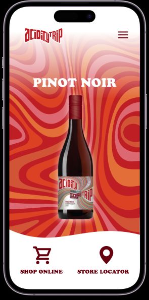
Bogle Winery came to our agency to design & develop a lifestyle website for their new micro wine label ‘Acidity Trip’. The marketing strategy for this wine was a play on 1960’s California hippie road trip culture with the wine’s flavor profile focused on the acidic nature of the grapes sourced.
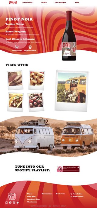
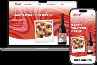
The brief requested a website that featured the different varietals created for this label, recommended food pairings with each one, as well as Spotify playlists and lifestyle photos that matched the overall brand essence.
Roles
Product Design Lead
2023


Strategy
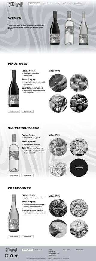
It sometimes feels rare in design to have ‘fun’ be a key component of the overall strategy. This wine label was a passion project of one of the client’s executives and they wanted that energy to come through to the customers. Utilizing the small number of core illustration assets they had, I created a colorful psychedelic aesthetic that felt representative of a 60’s California wine tasting trip fit for the contemporary web.
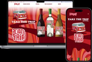
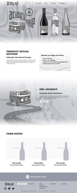
For the main header I created a long flowing psychedelic background vector file and generated a color-shifting animated JSON file using After Effects & Lottie. I also used their existing van illustration and created a burgundy-red road path in perspective that transitions into a hard edge wine spill at the fold for a benefits module for the wine label.
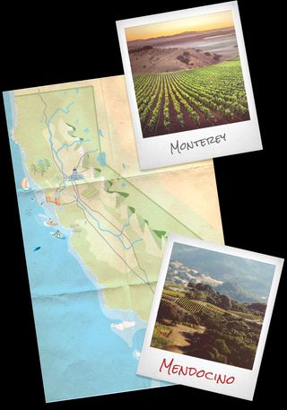
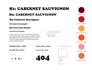
For the brand aesthetic, I got to step outside of the usual toolbox of modern web fonts and chose to go with Cooper Black for the main headers as a throwback to printed event flyers of the era, with Trade Gothic Condensed and Regular for the subheaders & body text. For the photographs on the site I created a Polaroid photo frame PNG and had the development team add randomized angles to the photos as the client added them in the CMS.
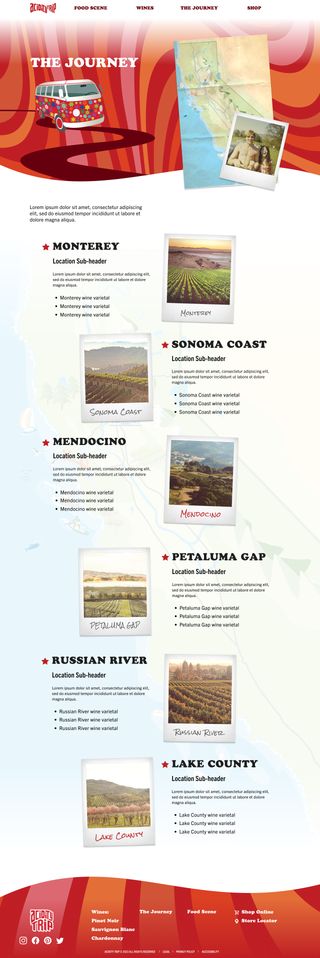
They wanted a page that showcased the vineyards up & down the California coast used to source the grapes for the wine. For this page I took the illustrated map of California provided by the client and added textures to make it feel like it had been in someone’s back pocket for a hundred miles. One idea that didn’t make the cut due to scope issues was an animated VW bus moving down the map as the user scrolled down the page past each vineyard.
I also used their existing van illustration and created a burgundy-red road path in perspective that transitions into a hard edge wine spill at the fold for a benefits module for the wine label.
When the project had been approved for development, I used some rare unbilled agency time to import the static header backgound into After Effects and generated a color-shifting animated JSON file using the Lottie plugin. This additional element added some dynamism to the header and further amplified the overall concept.
