Case Study: Bar Tab Application
Mission
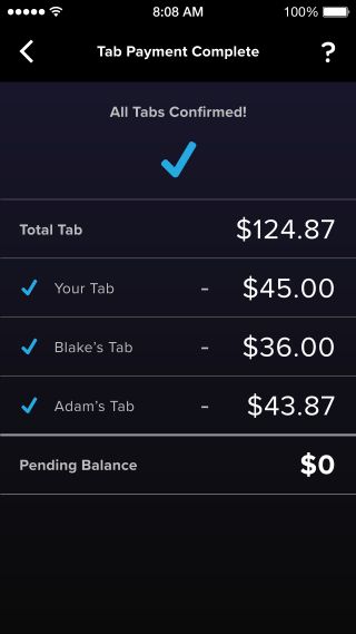
Circle invited several designers to Boston to participate in a creative retreat to imagine new use cases for their consumer payment platform. I conceived of, wireframed and prototyped Bar Tab, a mobile app for quickly splitting up a restaurant & bar check.
Roles
Product Design Lead
Strategy
Before Venmo and CashApp became the de facto way to settle up restaurant bills amongst colleagues, there was a wide open need for a solution to digitally dividing a check. My strategy was to have Circle be early to market with a restaurant payments solution that was built on top of their blockchain payment platform.
- Effortless sign-up process for new users in a bar.
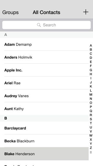
- A Bar Tab user could send phone contacts a payment link for their portion of the bill to pay if they don't have a Bar Tab account.
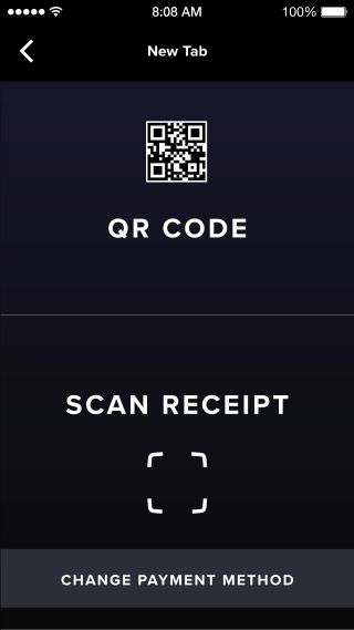
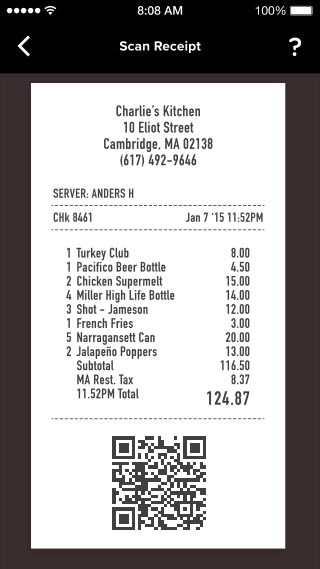
- Participating restaurants & bars could provide a quick payment QR code on their receipts for users to scan.
- Non-participating restaurant receipts could be scanned into selectable line items to easily calculate accurate the user's total.
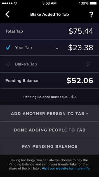
- The user could have the option to quickly pay the entire or remaining portion of the bill and send payment links to friends later.
- Users could pay with a Circle account or a linked traditional bank account.
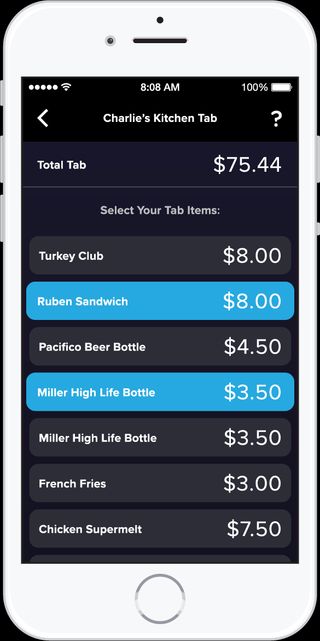
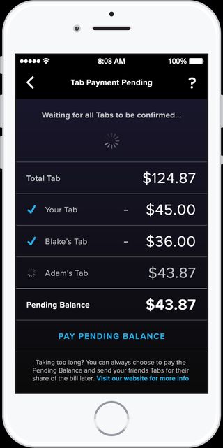
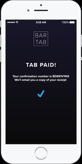
The power of this app would come from it's simplicity to make a challenging social experience easier. I knew that if the complexity hampered convenience the value of the concept would be greatly reduced.
The business value for Circle would come from either service fees from participating restaurants & customers paying their share without a Bar Tab account, or it would come from user base growth from users looking to avoid fees.
Restaurant and bar stakeholders would see a value in reduced credit card processing fees and time savings from staff running multiple cards to split a tab.
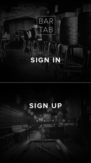
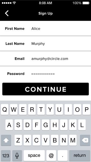
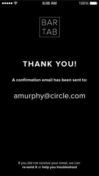

I designed the application architecture and wireframes for each screen, making sure that every one of my functional requirements were met. Once I had refined the screens to be ready to present, I assembled them into a functional Invision prototype.
Conclusion
I presented the prototype and concept brief to the company and it was very well received, but ultimately they decided to focus their limited startup design and marketing resources on the primary Circle Pay application. While it was disappointing to not be able to further refine and ship the finished app, it was a healthy exercise in accepting that solid ideas don't always arrive at the right time and to be proud of good work when that happens.
