Case Study: Mikuni Sushi

Mission
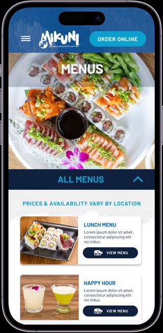
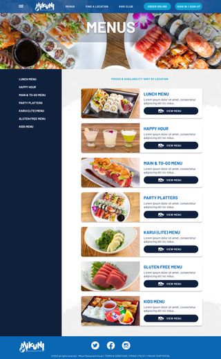
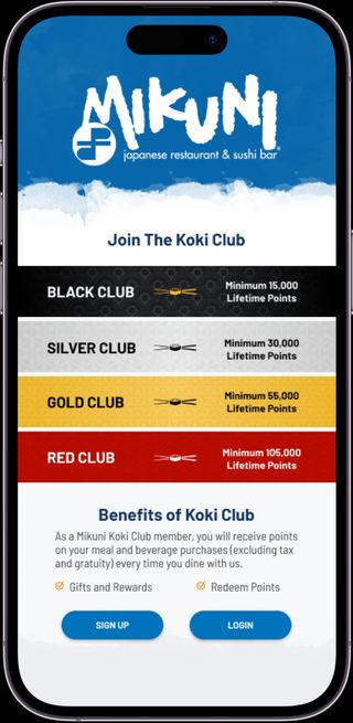
One of the first projects I started when I joined Three29 Media was to design an integrated website & mobile app for a Sacramento based sushi restaurant chain. The project had been started by a previous designer that had left the company and I was tasked with picking up the project from scratch on a very aggressive timeline to make up for the lapse in progress.
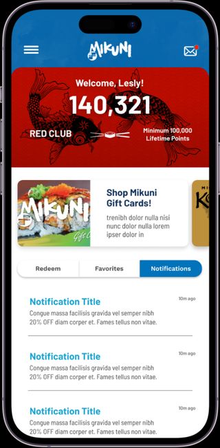
The website & mobile app had to include all the essential restaurant website functionality, in addition to online ordering using a Third-party provider, customer profiles with redeemable loyalty points, online store, and table reservation system.
Roles
Product Design Lead
Illustrator
2022-2023
Strategy
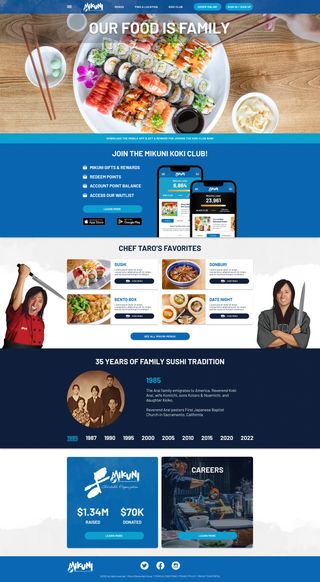
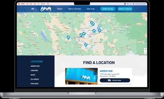
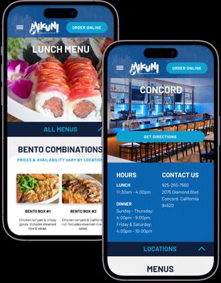
This project was almost fatally behind schedule when I joined the company as the sole designer. With a single month to have the foundation of the website and mobile app completely designed, my plan was to utilize all the graphic and textural elements of the newly minted brand guide to carry through a consistent branded feel to each page. Combined with the anticipated quality stock photos and the unique interior design of each location, I knew I could efficiently design each page to be beautiful and branded without adding additional functional complexity for development that might further delay the timeline.
Project Requirements
- 30-day deadline for wireframes, desktop & mobile website screens, and mobile app deliverables.
- Responsive website with individual location landing pages with each location menus.
- Mobile application with member loyalty point dashboard, point redemption merchandise store, restaurant reservation system, and online ordering capabilities.
- Multiple detailed flexible vector illustrations of the client’s figurehead chef for use on the website, application, and novelty restaurant merchandise.
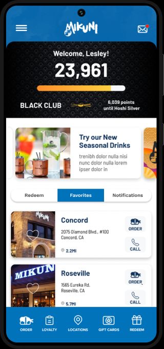
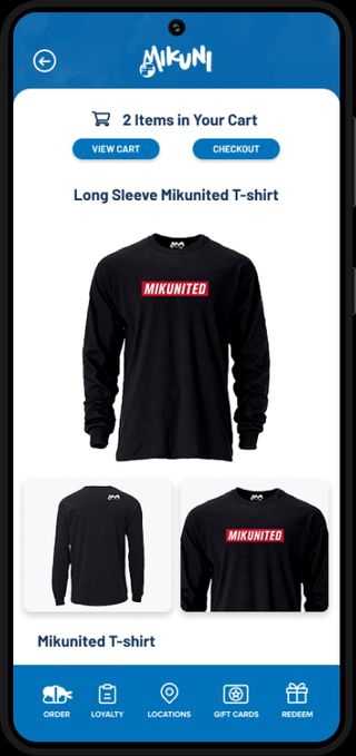
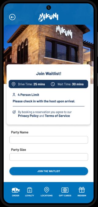
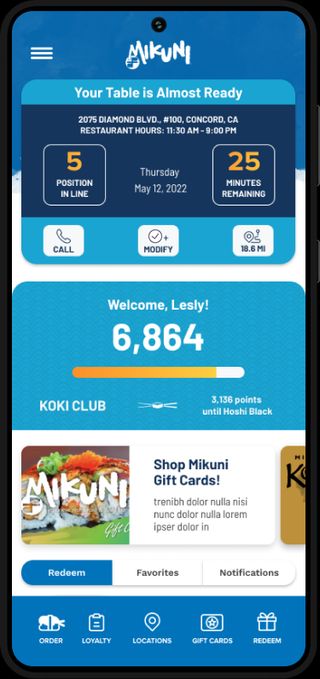
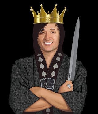

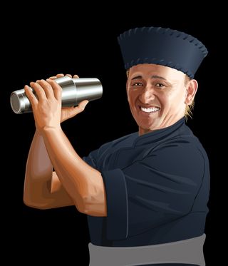

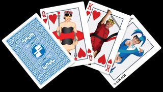
While this project was proceeding, I was asked by the owner of the agency to take on an illustration project for the same client to create a deck of novelty playing cards for the restaurant group that would feature the figurehead sushi chef and his wife as the face cards. I created multiple vector illustrations of the subjects as the King, Queen, Jack and Joker as well as a custom illustrated pattern for the playing card back.
Because these were vector based illustrations, we were able to quickly modify them for use on the sushi restaurant website project, with the ornate crowns and clothing removed. This gave the client additional high-quality illustrated elements on the website without drastically increasing the budget.
Before the final app went live I received a brief to create a fun & interesting loading screen. I illustrated a cartoon sushi roll & hand with chopsticks in Adobe Illustrator with the individual components broken out for animation rigging. In Adobe After Effects I animated the sushi roll bouncing onto the screen with tiny bits of rice flying out along different paths, with the hand reaching out with chopsticks to grab it.
Conclusion
The overtime design effort was able to get the entire project back on track, in development on time and preserve the client’s positive relationship with the agency. With additional time, the project would have benefitted from more time refining the UI in the wireframe phase and pushing back on some unusual specifications that cascaded from some of the earlier efforts. Given the total number of screen views required with the ambitiousness with the deadline I feel proud of my overall efforts and the original illustration work I was able to provide.
Challenges
- Limited time for UI/UX refinement
- Certain technical limitations and requirements from development based on short timeline & prior development work
