Case Study: Radius Application
Mission
I was tasked with redesigning a real estate data & risk report application called Radius. The client had already built a skeletal engineer-designed beta web application that would allow a user to search for and save individual parcels, and purchase printable PDF risk reports generated with data from local, state, federal & private databases.
With this redesign we took the foundation of their application and devised a strategy for a new responsive desktop & mobile application that would display digital versions of purchased reports. It was important that the application be easily understood by older desk-bound banking customers, while expanding opportunities for new customers to purchase reports while viewing parcels and properties.
Roles
Product Design Lead
2022-2023
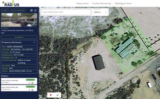
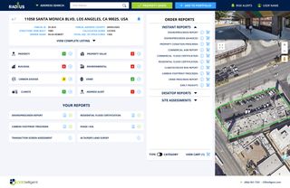
Old Radius saved property dashboard vs. new design
Strategy
Our strategy for the redesign kept the existing functionality and included additional features like a main user dashboard, capabilities for creating portfolios of multiple properties, a payment flow for ordering multiple reports of different types for both individual properties and multiple properties in a portfolios, & web views of each report product that are currently only offered as automated PDFs.
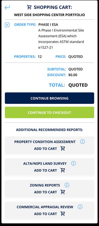
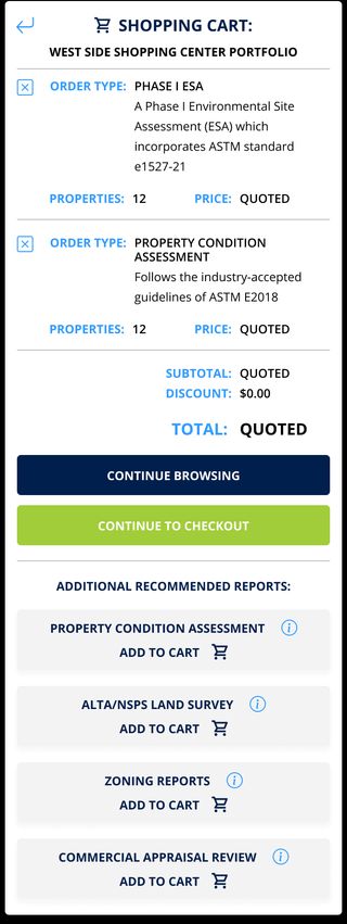
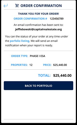
This project came with an array of complex UI/UX challenges. I designed an entirely new shopping cart flow that included functionality for a user to order an automated instant report for a fixed price at the same time they were ordering a physical site assessment report that would be quoted out after the user submitted essential property information.
I also included the functionality to order multiple products for an entire portfolio of properties, with the ability to remove individual properties and/or products from the cart to prevent them from abandoning the entire order. Users also had to be able to include site contact information and attach required legal documentation for certain site assessment reports.
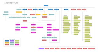
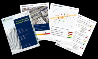
Printable risk report PDFs transitioned to interactive reports integrated into the application.
The wide variety of users and their real estate holdings presented the biggest challenge to a unified user experience. We created a dashboard and site architecture that allowed for any user to access their needed functions with a single click.
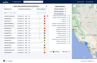
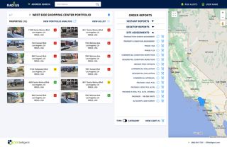
This client wanted this application to cater to new users with a small number of properties, as well as larger banking customers who managed multiple portfolios containing many properties. To achieve a unified experience for each, I designed the saved property & portfolio views allowed users to see their properties in a larger cells with a google maps preview of each property, while also switching to a list view for users with an extended number of saved properties or portfolios. The result was easier usability for each type of customer without the dashboard feeling sparse for newer users.


Conclusions
The client was so impressed with our methodical approach to designing this application and the functional insights we provided that it increased the development budget exponentially and extended our design retainer for another annual contract. The incremental progression of the project didn’t allow for much evolution of the brand logos or colors, but even a modest reimagining of these platform wide elements would have added an additional level of sophistication to the app.
Challenges
- Incremental design process limited more platform wide brand evolution with application
- Crucial dashboard content & hierarchy decisions were in-flux through the end of the final beta design round. More decisive decision making earlier would have allowed for additional dashboard refinement.