Creative Direction
Overview
In 2012, I formed a design company that acquired
Commonwealth Skateboarding, Portland’s only
indoor skatepark, and built out a retail skate shop
& local brand in the reception area of the space.
From the start, this role required a substantial
remodel of the interior store space on a shoe-
string budget and fabricating modular product
displays from scratch. Many of the detailed retail
and branding plans laid out in my business plan
had to adapt to financial or cultural circumstances.
Store Interior Remodeling
The initial plan was to rebrand the store with our
company brand and keep the skatepark itself
informally named ‘Commonwealth’. When the
acuisition was compete I quickly realized that the
Commonwealth name had a lot more cultural &
market value than initially perceived.
When I began executing our retail plans, I adapted
the few established Commonwealth branding
elements we inherited into a more elevated retail
experience.


I measured the space to make detailed
plans for retail displays. These first displays
needed to fill the shop with the initial
assortment of products we could afford to
stock, but could also be redesigned to grow
and change with our inventory needs.
The existing layout of the retail space
had a small office that divided the rear
half of the store into a tight hallway and a
cramped private space. Using Illustrator
and SketchUp, I designed 2D and 3D plans
for a new layout that would demolish half
of the office wall and build an extension of
the remaining portion, connecting to the
perpendicular wall on the other side. This
create a much more open private space for
inventory storage and operations.
The advanced planning allowed me to frame
& finish the wall in a very short period of
time without additional help.


Evolution of retail space from acquisition. All product displays shown were designed and fabricated by Matt Collins.
Commonwealth Brand Development
We didn't inherit many brand assets when we acquired Commonwealth, and those that did exist needed a lot of work. The existing logo was a cartoon foot with a wing and the previous owners had established sharks as a the mascot of the skatepark.
Wanting to build a brand that felt representative of the people who call it home, I embraced these elements and created a system of logos and illustrations that felt as fun as the skatepark. The original foot & wing icon felt somewhat arbitrary as it was, but I thought the concept of a snapped off ankle with a cartoon bone was a nice mix of humor with a nod to the injury potential a-la Bones Brigade.
Original Branding
New Branding


Commonwealth Products
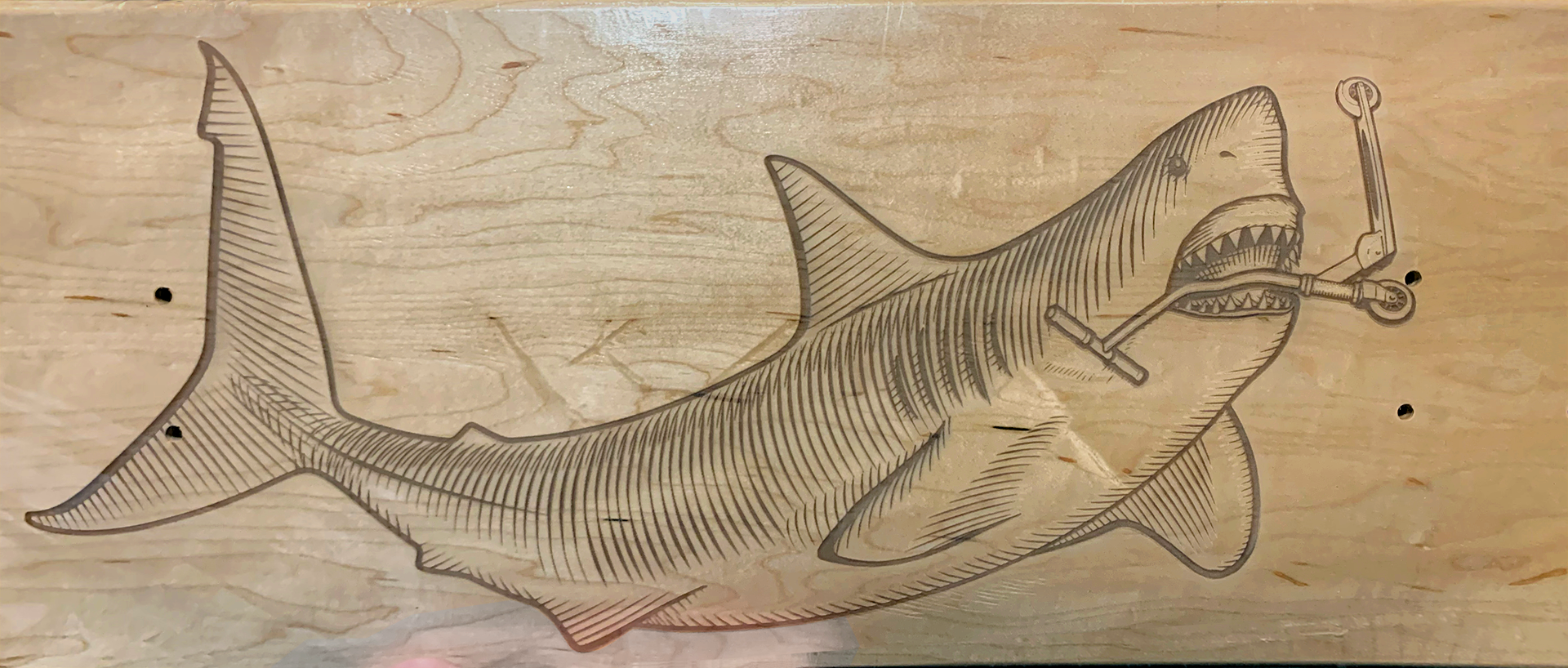
Sharks were the other central icon inherited with the skatepark. The park featured 2 large shark murals and sharks appeared in graffiti, social media posts and even tattoos (seen below).
One of my first illustrations created for Commonwealth products was a great white shark eating a scooter (titled "Apex Predator"), which was a reference to our policy of being skateboards only. I created a full-color version intended for stickers and skate decks, and a 1-color version designed for screen printing and laser/CNC processes.

Hammerhead Mural by Unknown Artist,
Shark & Millhouse Mural by David Wheeler,
Shark Tattoo via Olivia Britz-Wheat,
Shark Trophy by Matt Collins


One of the first original graphics I started working on once I completed the essential brand elements was an illustration of Portlandia riding a skateboard with her trident. The first attempt at this graphic was a more direct reference of the iconic statue of the subject in downtown Portland. Initially I adorned the figure with trad tattoos and added a beer can impaled on the trident.
While this verion looked great in test prints, I felt like it wasn't quite there yet. I thought the figure felt kind of lifeless and the beer can detracted from the elevated aesthetic I was going for. I had already established a sense of humor with some of the other illustrations I created and wanted one graphic that was more classic.
For the final version I hired a local model and staged a photo shoot to capture the right confident pose. Once I had the final 1-color version locked, I created an inverted vector version with slightly wider strokes to allow for discharge printing on dark colors. A second version with tattoo sleeves on a separate layer was intended for seasonal iterations, but the pandemic disrupted all production plans.


Original Version

Final Version


Wholesale Products & Licensing
One of the goals when I founded the company was to grow the business beyond a single location service & retail business into an established skate brand. One of our biggest succecces cam from an illustration I created of Bernie Sanders riding a skateboard.
The response to the design was beyond my imagination and we ended up receiving the first of many large wholesale orders for apparel & stickers featuring this graphic from a large international skateboard retailer. The consistent retail success resulted in continued orders for additional candidate illustrations I created for the 'Gnarly Election' series. We also had success selling these products directly online and through another skateboard distributor.


The success of our wholesale products and effective use of social media led to larger awareness of our brand within skateboarding. A small line of funny, political pop-culture parody graphics was particularly appreciated by a Tokyo based skate boutique retailer F.A.T., which licensed multiple graphics for use on numerous printed and cut-&-sew apparel products.


F.A.T. Tokyo Brand Book featuring Commonwealth Skateboarding graphics licensed for seasonal apparel collection.


Deluxe Distribution included us in a small group of skate shops to create custom Real shop decks. Design by DLXSF

Fabrication & Creation
The financial realities of the early years of the business required having to design & build almost all of the retail displays and fixtures myself. Displays needed to be capable of being modified to grow with inventory needs and have materials be reused.
Old skateboards were a readily available material of high quality and strength that I used to create all kinds of skate shop fixtures and signage.


For a period of time our business had a
lucrative partnership agreement with a
particular distributor and as part of that
agreement I created a dedicated display for
all of their products.
When the agreement
lapsed, I was able to design an entirely new
apparel display in the middle of the store
using the same cedar without having to buy
any additional lumber.


2001: A Space Odyssey mural by Matt Collins
The skatepark itself was also the focus of
numerous design projects. I created detailed
plans for contractors to remove inconvenient
structural elements we inherited. I also
created plans for the building of 2 new
concrete ledges for street skating.
When the property manager provided me
with building blueprints of some fire egress
changes they had to make, I used them with
my own skatepark measurements to create
an accurate 3D model of the park in Blender.
Once the model was built, I took detailed
photos of each wall and mural to wrap the
polygon surfaces 1:1.

Blender 3D model of Commonwealth Skateboarding by Matt Collins

